 Facebook
 Instagram
 Twitter
 Youtube
 TikTok
 Newsletter Subscribe
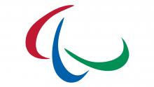
The Agitos Logo – Paralympic Symbol
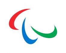
The Paralympic symbol, known also as the Agitos, is the visual representation for the Paralympic Movement.
Definition
The Paralympic symbol consists of three elements in red, blue and green – the three colours that are most widely represented in national flags around the world.
Meaning of the Paralympic Symbol
The Paralympic symbol is the heart of our identity, symbolising the Paralympic values of courage, determination, inspiration and equality.
The three elements of the Agitos (from the Latin meaning “I move”) encircling a central point symbolise motion and emphasise the role of the Paralympic Movement in bringing athletes together from all corners of the world to compete and achieve sporting excellence. The symbol also emphasises the fact that Paralympic athletes are constantly inspiring and exciting the world with their performances: always moving forward and never giving up.
History of the Paralympic symbol
1988-1994
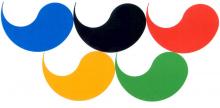
The previous Paralympic logo incorporated the Tae-Geuk, which is a traditional Korean decorative motif. According to oriental philosophy, Tae-Geuk refers to the ultimate reality from which all things and values originate.
Tae-Geuks were first used in a symbol at the 1988 Paralympic Games in Seoul, Korea. At that time, the logo consisted of five Tae-Geuks in a configuration and in colours similar to the Olympic Rings, ie, blue, black, red, yellow and green.
The configuration of five Tae-Geuks was used until the 1994 Paralympic Winter Games in Lillehammer, Norway.
1994-2004
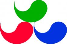
In order to create more differentiation from the Olympic symbol, a Paralympic logo with three Tae-Geuks was officially launched on a worldwide level at the 1994 World Championships for IPC Sports, along with the motto Mind, Body, Spirit. The three-Tae-Geuk design was in use until the Closing Ceremony of the Athens 2004 Paralympic Games.
2004-2019
In 2003, after a strategic review process, the IPC commissioned public relations company Scholz and Friends to modernise the existing Tae-Geuks for the third time and bring a more tangible meaning to the IPC’s purpose.
They decided to use the current Paralympic logo, familiar and well-recognised as it was from within the Paralympic Movement since 1991, morphed into a more circular style but retaining the same colours of blue, red and green. The Agitos would also incorporate the wording of ‘IPC’ embedded within them.
This symbol was launched, together with a new motto, Spirit in Motion, at the Closing Ceremony of the Athens 2004 Paralympic Games. When handing over the flag to Beijing, a flag with the new symbol was used.
The new Agitos logo was fully integrated into a Paralympic Games for the first time at Torino 2006 and has become increasingly recognised around the world in the following years.
The Agitos represented a fresh new look and vision for the IPC and a watershed in developing the global ethos of what was becoming one of world’s most cherished brands.
2019-present
The IPC worked with London-based design agency North, to strengthen the appearance of the Agitos and future-proof it for a digital-age, giving it its first overhaul since it was launched in 2004.
The Agitos, the Paralympic symbol, was redrawn so that each of the three individual elements is exactly the same. The spacing and geometry was also refined so that the three elements are now rotating around a shared central point.
The colours were also updated to match the vibrant Paralympic values. In the interests of sustainability and reducing ink when printing, the IPC adopted the red, blue and green used by the International Olympic Committee in the Olympic Rings.
The IPC launched a bold new look as part of a wider strategy to make the Paralympic brand more impactful and meaningful to a global audience. In addition a new brand narrative – “Change Starts with Sport” – was created to better communicate the transformational impact the Paralympic Movement has on society and drive the human rights agenda.
Through the new-look IPC brand and narrative, the IPC aims to use sport as a catalyst to change attitudes and create more opportunities for persons with disabilities, in particular, through improved mobility and accessibility.
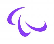
Official version of the Paralympic Symbol
There are currently three official versions of the Paralympic symbol.
The full-colour version on a white background is the preferred version, but a black-and-white monochrome version is also available. In addition, a special-edition purple version was created for the launch of the WeThe15 campaign.


Other Paralympic properties
Paralympic properties include the Paralympic symbol, Paralympic terminology, Paralympic flag, Paralympic anthem, Paralympic designations and emblems, Paralympic flame and torches. All rights to any of the Paralympic properties, including the right to use and license the use of the Paralympic properties, belongs exclusively to the IPC; including the use of the Paralympic properties for any profit-making, commercial and/or advertising purposes. The IPC also owns and controls the non-commercial use of the Paralympic properties linked to the IPC’s vision and mission. The IPC may license all or part of these rights under such terms and conditions, as it shall determine.
Use and rights
The Paralympic symbol cannot be used without the International Paralympic Committee’s prior written consent. You can send a detailed request to brand@paralympic.org including the following information:
- Name, address, telephone number/email address of entity making the request
- Content concerned (text, images, films)
- How will the content be used? (privately, for broadcast, schoolwork, exhibition etc)


